The Women’s Center in Carbondale, Illinois, opened in 1972 as one of the first domestic violence shelters in the United States. It offers emergency shelter, a 24-hour crisis hotline and free counseling for survivors of domestic violence and sexual assault across Southern Illinois. Today it is known as the Survivor Empowerment Center.
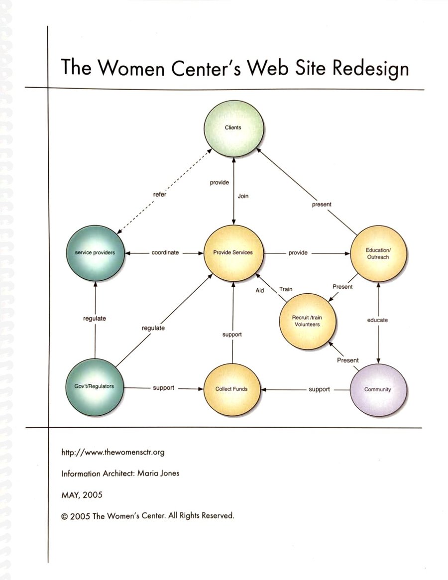
In 2005 I led the redesign of their website as its information architect. Before any design, I did the research: interviews with the executive director and the staff working directly with clients, a review of the existing site, and a map of everyone the center serves and works with. A website for a shelter has very different users from most: someone in danger, often in a hurry, sometimes on a computer the person hurting them can check. Every decision started from that.
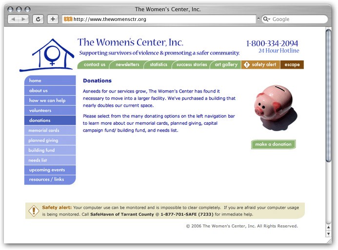
The old site was cold and hard to navigate, and the most important thing, the emergency number, was nowhere to be seen. So the essentials came first. The 24-hour hotline sits at the top of every page. A Safety alert in the footer explains that computer use can be monitored and is hard to erase completely, and points to a phone number instead. An Escape button, always in the same place, takes you away from the site with a single click.
The concept map showed four main audiences: clients, the community, volunteers and donors. For each one I listed what they need to know and the feeling the information should convey. For survivors, that was security, safety, warmth and hope. For donors, trust and transparency. The navigation followed from that: a side menu for help, volunteering and giving, a top menu for the center’s story, colour-coded sections so you always know where you are, and every page reachable in two clicks or fewer. The plan also called for plain language that speaks directly to the reader, an English & Spanish version, and Section 508 accessibility.
I also built the site myself, coding the front end in HTML & CSS so the pages stayed light, fast to load and accessible, with the hotline, safety alert and escape button working the same on every page.
The look is calm on purpose: soft, low-saturation colours, gentle curves and a simple house as the logo, to feel safe and caring while still showing donors and partner agencies a professional organization.